 Harmony 880 stuff
Harmony 880 stuff
Harmony 880 stuff
You can download the over 300 icons and backgrounds available on this site right here:
If you need help with your remote check out one of these sites:
Here are some quick notes I've made as I played around with the 880's background feature.
First of all, here is the default background for the 880:

There seem to be three different areas you need to note when making backgrounds:

- The dark blue bar on top is where the time, battery, and screen title appear on the remote.
- The white area is where the different "buttons" appear.
- The lighter blue bar on the bottom is where the page numbers appear (for example if you have two pages of favorites the bar at the bottom would have arrows at both sides and say"1 of 2" in the center).
It appears that the two blue bars CAN NOT be changed (if this is incorrect please let me know). If you upload a new background to your remote, these two blue bars will be put ON TOP of it. The blue bars can clash with certain colorful backgrounds like this green and yellow one I created before I knew about the problem:
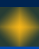
Hopefully a future update will change this so the text can go right on top of the background or Logitech will add more themes with different colored bars.
Here is a basic background I've made that uses the limitation to its advantage. It is a simple gradient from the dark blue of the top bar to the lighter blue of the bottom bar.

Lastly for now is a layout of how the screen elements come together:
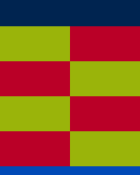
The yellow and red rectangles are where the buttons are placed. I was originally going to use this to make a background with new icons for my activites, before I remembered that it would be used on all screens, including the devices and favorites screen where it would look out of place! But it is still useful as a guide for making backgrounds so you'll know where things are layed out. And, surprisingly, it isn't such a bad background to actually use on you remote either!
OK one more last thing! If you make a background and find that it clashes with the icons and makes the text hard to read, don't forget that you can turn the icons off and just have text buttons. That option is in the settings on the website.